Most gardeners love to inject their garden with a huge dose of colour, Whether that’s flamboyant bedding schemes, flowers for cutting or the spring spectacular of flowering bulbs.
Colour is the lifeblood of most gardens. But it doesn’t have to be dramatic and lairy, it can be soft and calming too.
Learning how to use colour effectively is a powerful tool in transforming your outdoor space. Harnessing the power of colour can completely change the whole feel, look and ambience of your garden in ways you may not have dreamt of. Done well it can create an instant effect as you pass from one part of your garden to the next.
It doesn’t have to be all about your plants either! You can use colour on the walls and fences of your garden or colour theme cushions and accessories in a dining area to create the vibe you crave.
One of my most colour changing revelations was walking into Claude Monet’s house in the gardens at Giverny where the colour scheme of the dining area was yellow and bright and vibrant, and then into the blue kitchen. The change in temperature was stark. The kitchen was a cool blue and created an instant shift in ambience. The power of the use and the change in colour was palpable and the skill of this illustrious painter was laid bare for all to see. And of course, outside the borders and gardens reflected this creative use of tones and hues.
Complementary colours
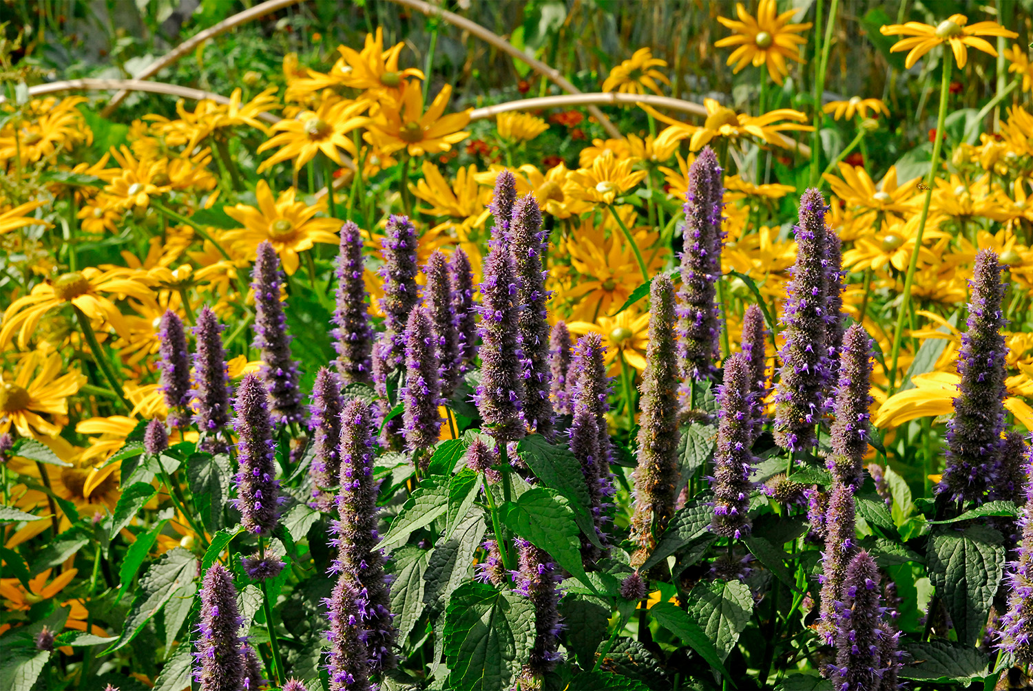
There is a science behind the power of colour. I don’t claim to be an expert but I am fascinated by its potential. It’s all based on the colour wheel and how opposite colours on the wheel have complementary contrast, so if you think about red, it’s opposite and complementary colour is green, blue is opposite to orange and purple to yellow, so these are also complementary colours. I’ve always called them flashing colours rather than complementary colours, but I am not sure why. But when you choose to use them in your garden design or even your artwork, they have a powerful vibrancy. When you dig deeper and start to look at the science of colour and learn about the primary colours of red, blue and yellow, these are colours that can’t be made from mixing other colours. But when you start to mix these together to form the secondary colours you get an exciting spectrum of orange, purple and green. I absolutely love the relationship between purple and orange (and between the other secondary colours) they seem to establish a mood, there’s red in both purple and orange and that generates a bit of heat or warmth. There’s a dynamic there that is rich and empowering and it’s something that can be recreated with plants, with fabrics or with paint.
The colour purple
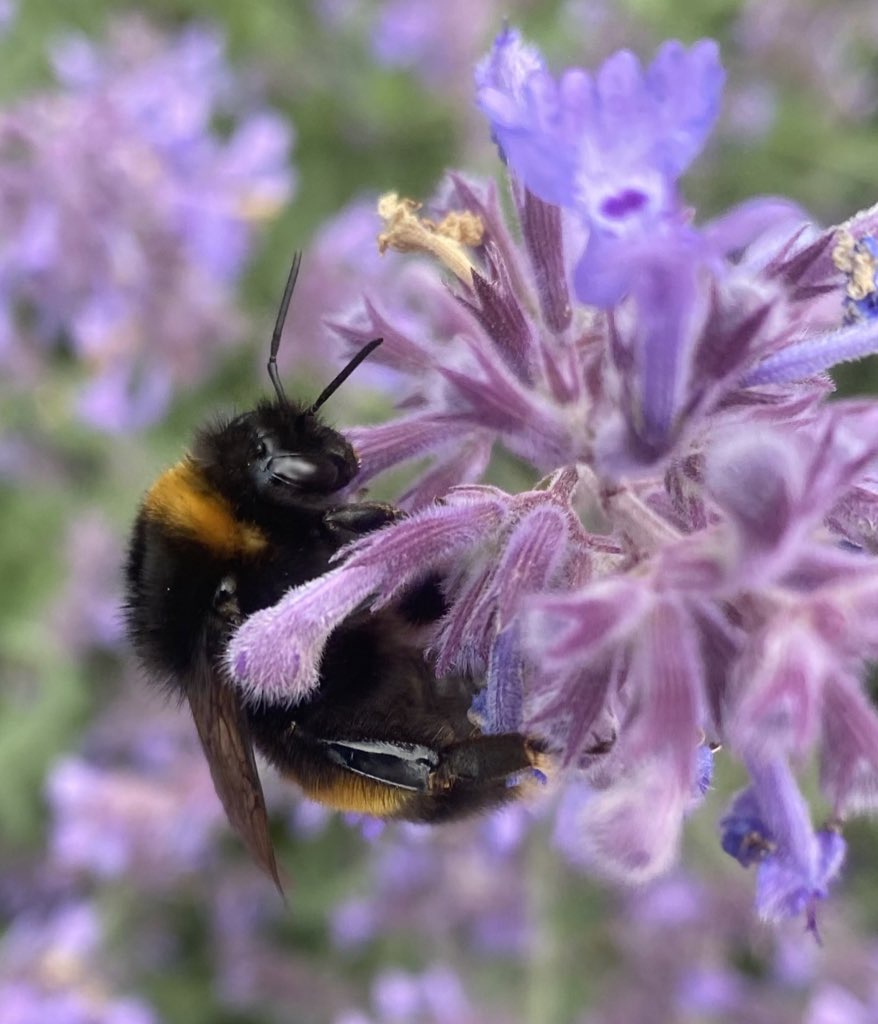
It’s not just me that simply loves the richness of purple; mauve, lavender and purple flowers are a magnet for butterflies and bees which are attracted to the purple shades and feed from the nectar rich flowers. Plants like hardy geranium, Verbena bonariensis, veronica, catmint, lavender, asters, agastache, salvias, alliums and even thistles all wear their purple capes with pride and offer a sumptuous buffet of protein rich pollen and energy rich nectar for pollinators. But you don’t need to restrict your colour palette to plants, you can choose purple paint and fabrics to adorn your outdoor space adding this warm and wonderful hue to the garden. Purple seems to go with anything. As a combination of cool blue and warm red it has temperature elements to suit any colour scheme and can be the punctuation in a border of colour dividing colours that clash and allowing their own persona to shine through with the purple partner plants softening and blending the effect. It’s a useful tool when choosing plant combinations and pacing the speed of the border. Mix it with white for a striking contrasting effect.
Tropical hot
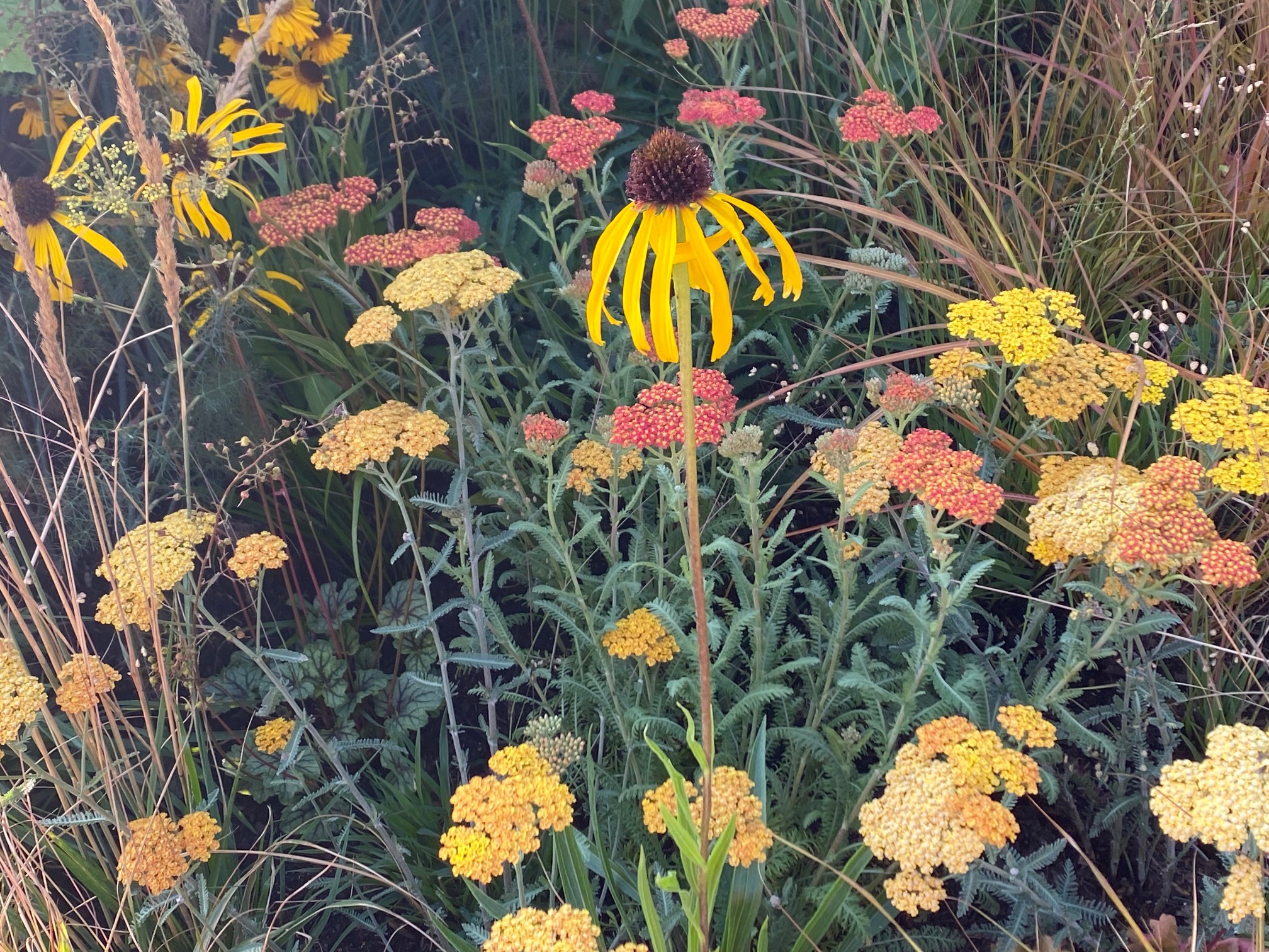
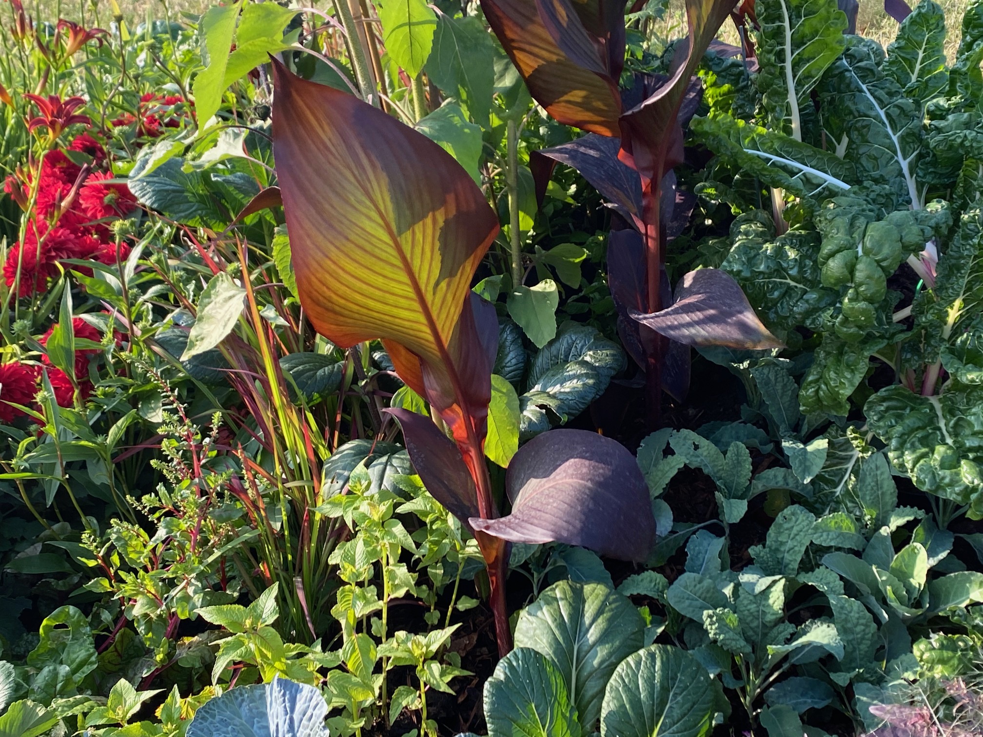
I don’t know about you but I love a bit of colour and vibrancy in life. So, for me it’s the bold colours that give the tropical exotic feel that I reach for when choosing new plants. Orange is my wonder colour, coupled with purple and then seasoned with yellow and red. Sometimes a hot border is a late summer spectacle, enhanced with the flamboyance of dahlias that have a strong tropical look. It’s not always the flowers that create that hot look, foliage can do that too. Plants like canna and Ensete have bright, large, bold leaves with red and strong stripes, but others like melianthus, fatsia and tree ferns inject strong shapes into the mix to support the flowering stalwarts. Many aren’t fully hardy and may need some mollycoddling in a frost-free greenhouse to get them through the winter.
Soft and soothing
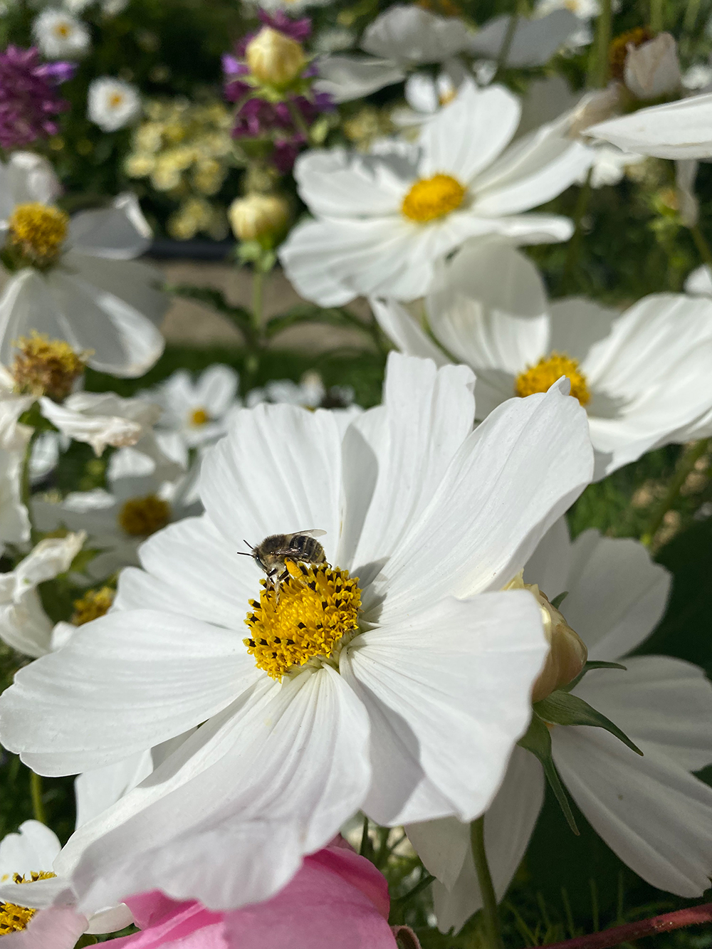
In contrast to the hot borders are the cooling effects of white and green. Where green isn’t just the leaves and foliage, sometimes it’s the flowers too. There is something very calming about a white border and often white blossoms are very scented too as in nature their perfume exudes at night when the moths are active. The white flowers ‘shine’ in the moonlight, their scent and presence attracting these night flying pollinators to their nectar rich flowers.
White borders need the foil of fresh, lush green foliage and our plant pallete doesn’t disappoint. Hostas, ferns, ginger lilies, and tetrapanax can all add drama to a cool white design, but the plant world is at your disposal and that’s all part of the fun!! There’s a lot of power in a white garden and of course you can season it with colour too or add variegated foliaged plants to lift the whole effect.
Planting with colour and theming your garden using colour and texture is a powerful tool and one that can add a whole new dimension to colour therapy and the healing powers of nature. Experiment, research a little bit more and harness all the benefits of your garden with a colourful outlook and a balanced palette.


