After the formal perfection of Chelsea Flower Show gardens, the relaxed atmosphere at the Hampton Court Palace Flower Show acts as a welcome contrast. There’s plenty of room to spread out in this gorgeous setting, and providing a tornado isn’t blowing or the heavens haven’t opened up, there’s nowhere nicer to be in July.
The RHS deliberately puts the emphasis on ‘grow your own’ at Hampton Court, so this is a good show for new ideas on what to grow. As well being a buying show where you can purchase plants, the other difference from Chelsea is that the RHS includes a section on Conceptual Gardens, which for me are one of the highlights of the show.
In previous years the RHS has tucked these gardens away in a corner somewhere, almost as an afterthought. This year they have been laid out along a path with plenty of room around them so that they can be viewed and experienced from 360 degrees. This year the gardens are stronger than ever.
A Fable For Tomorrow by University College Falmouth highlights the pressures faced by native British Flora, with some species facing extinction. A seed bank, dramatically parted in two acts as a ‘modern day Noah’s Ark’. The copper inside glistens against Cornish sand. Viewed from the outside this mounded garden suggests there is a siege going on, the bunker-like structure reminiscent of WWII gun turrets on the beach.
Supermodel by Alan Gardner poses the hypothesis that thinness is what now defines beauty. Tall, pink poles and tall thin plants dominate. It’s a simple, but effective idea when you see it and think about it.

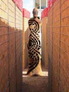
Hearts and Minds Heat Sand Mines by Steve Wooster, who is a distinguished photographer as well as a designer, commemorates the fact that more than 400 soldiers have recently been killed in Iraq and Afghanistan with more suffering terrible injuries, both physical and mental. Four corridors, made from breeze block and lined with chip board, lead to a central figure. These walls are enclosed in metal gabions or cages. They are topped off by red plastic to symbolise blood. The materials are ugly and feel make-shift, again adding to the sense of disquiet. The figure in the middle, bathed by strong sunlight, suggestive of foreign climes, is made by Walter Bailey. Seen from these narrow corridors one is reminded of a sniper down an alleyway, but who is the person at the end and who is the sniper? The figure at the end seems that of universal man or woman. Around the outside, olive trees are the emblem of peace.
The Pansy Project Garden by Paul Harfleet left me with mixed feelings. The large, shattered concrete blocks symbolising homophobic hate crime were powerful, but as a gay friend who saw it with me said: ‘I think we’ve all moved on from the idea of homosexuals being pansies’. There are so many varieties of pansy, in the strong sunlight the ones in this garden looked a little washed out and didn’t provide as much contrast to the pale concrete as they might have done. (This garden was awarded the best garden in the Conceptual Garden category, so I’m obviously out of step with judging here!)
Forces of Nature by Guy Petherham looked at the contradiction between the way we control nature and our dependence on her, showing us that we are more vulnerable than we think. A willow figure props us a tree, one of a group of silver birches which have been planted at an angle. As the wind blows the trees rustle and the figure clings on, blown a little from side to side.
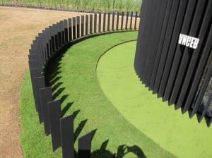
My favourite garden in this catergory was Journey to Awakening by Japanese designer Makoto Tanaka (Sekitei Design). This Zen garden was created for the purpose of meditation and enlightenment. It’s a series of concentric rings: the black metal slats outside represent the 108 desires Buddhists believe cause human suffering. The reflective pool inside is our unconscious mind: you step through into it, carefully and through a narrow path. The words which are written on the outside, upside down and unintelligible make a reflection in the water the right way up: fear ….anger… the impulses which cannot always be seen from the outside but which prevent clarity in the mind. There is no denying that Japanese designers have a special affinity with light, almost as if they were taught that it’s a separate element in itself.


